Silk or paper: reading the ground off a Buddhist painting
- Title
- Shaka, the Historical Buddha, with Two Attendant Bodhisattvas and Sixteen Arhats — Met 2015.300.1
- Period
- Japan, Kamakura (1185–1333)–Nanbokuchō (1336–92) period, 14th century
- Region
- Japan
- Medium
- Hanging scroll; ink, color, and gold on silk
- Dimensions
- Image 142.5 × 75.7 cm; overall with mounting 245 × 99.3 cm
- Collection
- The Metropolitan Museum of Art, New York
- Accession
-
2015.300.1 - Rights
- Public domain (CC0, Met Open Access). The Metropolitan Museum of Art, Mary Griggs Burke Collection, Gift of the Mary and Jackson Burke Foundation, 2015; accession 2015.300.1; object 53179. Public-domain status re-confirmed via the Met Collection API 2026-05-18.
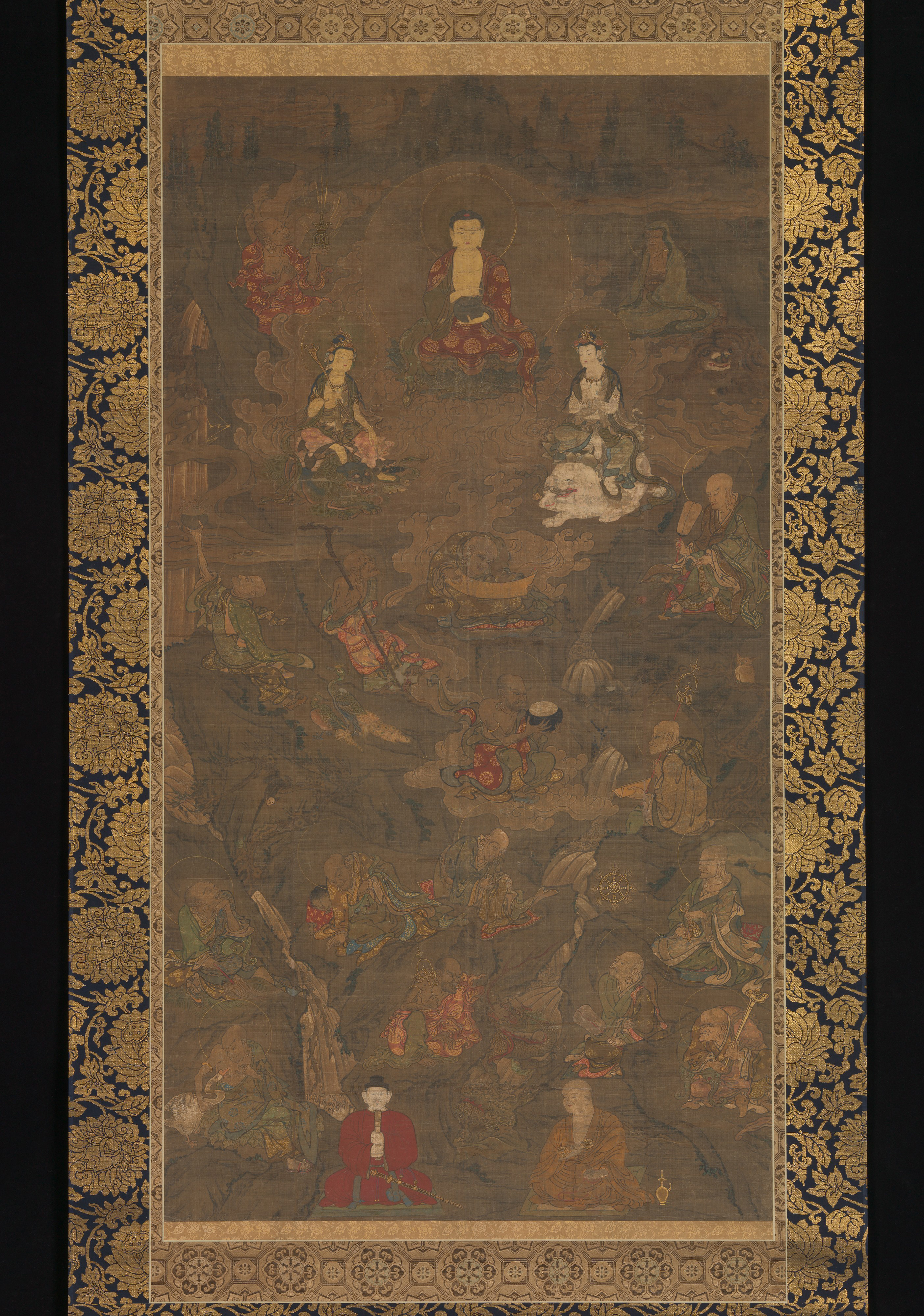
Met 2015.300.1, a 14th-century Japanese hanging scroll, image 142.5 × 75.7 cm. Shaka preaching at Vulture Peak with Fugen, Monju, the sixteen arhats, and the Japanese patrons Shōtoku Taishi and Kūkai below, in ink, color, and gold on woven silk now darkened by age. The ground is the subject here: a prestige silk icon, read off its own surface. Met Open Access (CC0).
Met 2015.300.1 is a 14th-century Japanese hanging scroll of Shaka with sixteen arhats, painted on woven silk. Read for its ground, it shows what silk does that paper cannot: a sized, semi-transparent weave that takes back-applied gold and color (urahaku, urazaishiki) and darkens with age, reserved for the prestige icon while paper carried the handscroll and the working drawing.
The first decision a Buddhist painter made
Before a line was drawn, a Buddhist painter in medieval Japan had already made the decision that governed everything after it: silk or paper. The terms are still the cataloguer’s. A work whose support is silk is kenpon (絹本); one on paper is shihon (紙本); the painted sheet itself, the thing that gets mounted, is the honshi.1 The choice was not neutral and not only aesthetic. It set what the ink line would do, whether gold could be worked from behind, how the surface would age, and (because materials cost money and signalled status) what kind of object this was going to be. Met 2015.300.1 is the silk case, and it is a good one to read because age has made the ground argue with the image instead of disappearing behind it.
The Met dates the scroll to the 14th century, the Kamakura–Nanbokuchō span, and gives the medium as ink, color, and gold on silk; the image field is 142.5 by 75.7 cm, nearly five feet tall before the mounting is counted.2 It came to the museum in 2015 with the Mary Griggs Burke collection. The catalogue reads the picture as Shaka preaching at Vulture Peak on a bank of swirling cloud, flanked by Fugen on a white elephant at right and Monju on a blue lion at left, the sixteen arhats ranged below in a landscape of jagged rock and waterfall, and two Japanese patrons among them: Shōtoku Taishi in a red robe at lower left, Kūkai at right.34 (That last detail bodhi had read wrong on the first pass, as a generic lay donor; it is corrected here.) None of that program is the subject here. The subject is the cloth it sits on.
What the silk is, and what sizing does to it
The support is a fine plain weave: a tabby of warp and weft in a regular grid, the standard painting silk the literature calls eginu, valued for an even surface and a faint sheen.5 At the resolution of the Met Open Access file the weave is directly legible across the whole field: in the bare, darkened ground between figures the thread lattice reads as a mesh under everything painted on it, and in the worn passages the individual threads carry the image like a screen. This is the first fact about a silk ground. It is not a continuous skin. It is an open textile, and the openness is the point.
Raw silk would not hold ink or pigment cleanly; an unsized thread wicks a sumi line outward and lets it bleed.5 So the silk was stretched tight on a frame and sized with dōsa (礬水), a thin solution of animal-skin glue with a little alum, brushed on to seal the fibre and stop the bleed.5 The preparation went onto both faces of the stretched silk, front and back, because both faces were going to be worked. That is a consequence of the documented Japanese reverse-coloring practice, not an inference: a tradition that lays pigment and leaf on the back of the cloth must seal the back as it seals the front.6 Park Chi-sun’s reconstruction of the closely related Goryeo workshops makes the same two-sided preparation explicit one tradition over.7 That two-sided preparation is the hinge of the whole technique. A paper ground is sized to be painted on one side. A silk ground is sized to be painted on two.
The thing paper cannot do
The reason to size both faces is that silk is semi-transparent and paper is not. Color and metal applied to the back of a sized silk read through the weave to the front, softened and held down a tone, in a way no surface application reproduces. The two techniques have their own names. Urazaishiki (裏彩色) is coloring from the reverse; urahaku (裏箔) is gold or silver leaf laid on the back.65 On the front the effect is a color or a gleam that sits inside the cloth rather than on top of it; the conservation literature describes the shimmer of back-laid metal and the back-laid pigment as deliberately muted, “softened” by passing through the silk.8
This is not a Goryeo borrowing or a practitioner’s reconstruction read back onto medieval Japan. It is a documented Japanese workshop method with its own chronology. JAANUS dates urazaishiki in Japan from about the 9th century and records its standard logic (thick paint on the reverse, lighter paint on the front, the two intensifying each other), with named early-13th-century instances in the three Jingo-ji portraits (Minamoto no Yoritomo, Fujiwara no Mitsuyoshi, Taira no Shigemori), where white pigment was added from the back.6 The Tokyo National Museum has reconstructed the sequence directly: its study of a 13th-century Kamakura Ichijikinrin (一字金輪, Ekākṣara-uṣṇīṣacakra), an Important Cultural Property, rebuilds the back-and-front coloring in five stages to show the colors as they read at the time of production against the muted state the silk holds now.9 Park records the same division of labour one tradition over, in the Goryeo workshops: flesh and the larger garment fields colored from behind, the front reserved for the drawn line and the final accents, corroborating the Japanese case rather than carrying it.7
On Met 2015.300.1 the consequence is visible precisely because the scroll is damaged. Shaka’s body is a single flat warm gold, unmodulated, the brightest plane in a field that has gone brown around it; the attendant bodhisattvas’ flesh is an opaque white that has stayed up and bright while everything thin near it has sunk. That contrast, a few passages still luminous and the rest darkened, is what an aged back-worked silk does. The conservation rule of thumb makes the mechanism plain: when the silk of a Buddhist painting abrades, the urahaku or urazaishiki on its reverse begins to show through from the front, because the front layer that was hiding it has thinned away.8 The gold you are reading on the Buddha may not be on the side of the cloth you are looking at. Paper cannot be used this way at all. A paper ground is opaque; gold on its back is simply gold you cannot see.
How the ground takes the line and the pigment
Sized silk and sized paper take a brushed line differently, and the difference is functional rather than a matter of taste. On the smooth sealed silk the contour rides on top of the weave as an even, continuous filament; the painter could draw the long unbroken drapery line and the thin gold halo ring that this style depends on, and the line would not feather. The halos here are exactly that: drawn rings, not washed disks, still legible as line where the wash around them has darkened to nothing. Mineral pigment behaves to match. Ground azurite, malachite, vermilion, and lead white sit in a glue medium as a discrete bodied layer over the sealed thread; the finer the grind, the better it keys to the silk.5 What survives bright on this scroll is exactly the heavy opaque mineral and the gold: the white bodhisattva flesh, the red of Shōtoku Taishi’s robe at the lower left, the gold of the Buddha and the small gold wheel. The thin ink wash that modelled the landscape has gone almost entirely into the brown of the aged ground. That the red lake survives where the ink wash failed is not a value judgement on the painter; it is the mineral-versus-organic split the conservation literature predicts, read off this one sheet.
Paper takes the same materials but answers to a different working logic. A sized, often burnished paper surface is splendid for the ink line under pressure and for sparing color; it is the ground of the handscroll, the narrative emaki, and the iconographic working drawing, where the line is the carrier and the color is a thin diagrammatic fill. bodhi has read that paper case directly on its own object: a Heian Zuzōshō section, ink and light color on paper, where the contour does the work and pigment is incidental, the document built to be opened in arm-span sections at a table.10 The decorated sutra is the other paper register: gold and silver written on indigo-dyed paper, the metal carried as ink because the opaque ground will not pass anything through it.11 Neither could have been done on silk economically, and the silk icon could not have been done on paper at all without losing the back-work. The ground is not a substrate the image happens to sit on. It is part of the image’s argument.
Why the icon is on silk
Function and cost ran the same direction, and they decided the ground. A hanging-scroll honzon, a principal devotional image meant to be installed, bowed to, and seen from across an altar in low light, wanted the things only silk gave: the depth and quiet glow of back-laid gold and color, a surface fine enough for the unbroken iconographic line, and the standing of an expensive woven support. Silk was the prestige ground, prized for its smooth texture and sheen and the luxurious finish it produced; it carried the icon for the same reason it carried the formal portrait.1 Paper was cheaper, faster, and structurally suited to the roll: it took the handscroll narrative and the workshop’s reference drawings, the objects handled in the hand rather than hung on a wall.
This is not an absolute rule, and the honest version says so. Handscrolls exist on silk; hanging scrolls and devotional prints exist on paper; the decorated-sutra tradition is a paper prestige register of its own. The correlation is a tendency produced by what each ground does and what each cost, not a law. But on a 14th-century scroll of this scale and ambition, a near-five-foot preaching assembly with a gold Buddha and sixteen arhats, made to hang, the silk is the expected and the legible choice, and the museum’s medium line records exactly that.4
What age does, and what it tells you
Silk and paper fail differently, and the failure is itself diagnostic. Aged silk paintings characteristically darken overall and turn brown, the conservation literature notes plainly, as the sized fibre oxidises and absorbs centuries of incense and altar smoke.8 The mineral pigments make it worse where they sit heaviest: ground azurite and malachite have a coarse crystalline structure that, over time, can lift and separate and stress the support beneath them.7 Met 2015.300.1 shows the whole of this. The ground has gone to a uniform deep brown that has swallowed the landscape and most of the modelling; pinpoint losses pepper the field where pigment has lifted and taken a fleck of thread with it; a faint vertical band runs through the upper image where a lining seam transmits its own line of stress. The image now reads as bright opaque islands floating in a darkened mesh, which is, exactly, an aged back-worked silk icon doing what such objects do.
A room moment makes the scale of the loss legible. This scroll was made to hang nearly five feet tall in a dim hall and be read from across an altar, where back-laid gold would have warmed and floated against a then-pale ground and the thin ink landscape would have set the figures in deep space. Under even museum light, behind glass, the relation has inverted: the ground is now darker than much of the painting, the landscape it organised has gone, and the eye is held by the surviving opaque passages the painter probably treated as secondary. The gold-brocade mounting at the scroll’s edge tells the same story by contrast: its protected, woven, patterned silk is structurally sound and still bright, a control sample for what the image field has lost.12 Paper of the same age would not have done this. Paper darkens and foxes and tears along the rolls and creases, but it does not turn the deep, even, image-swallowing brown that an old sized silk turns, and it has no back layer waiting under an abrading front to surface as the top goes.8
The disagreement, and what the ground can and cannot settle
Where does scholarship divide here? Not over whether silk and paper differ, which is settled, but over how hard the function-tracks-ground correlation should be drawn. One reading, the cataloguer’s working convention, treats the pairing as effectively structural: the silk hanging-scroll icon and the paper handscroll-or-drawing as two distinct production lines with their own materials, costs, and clienteles.1 The other, which the conservation and technical literature pushes toward, treats the medium line as a tendency with real exceptions (silk handscrolls, paper devotional images, the indigo-paper sutra as a paper prestige object) and warns against reading the ground as a reliable proxy for function or date.8 bodhi reads with the second, but only just. The correlation is genuine and worth stating because it is driven by what the grounds physically do and what they cost; yet it is a tendency and not a test, and a single object’s ground tells you what was possible and what was likely on it, not what it must be. This is precisely why the ground is one input to dating and never the verdict. The convergence-of-evidence problem is its own study on bodhi and is not re-argued here; the support is read for what it is, not run as a clock.13
The residual uncertainty on this specific scroll is honest and bears naming. That reverse-side work was a standard Japanese method from the 9th century forward is documented, not analogised: JAANUS dates it, the Jingo-ji portraits instance it, the Tokyo National Museum has reconstructed it stage by stage on a dated Kamakura painting.69 What remains inferential is this object. The presence and extent of urahaku or urazaishiki on Met 2015.300.1 is argued from the survival pattern and the documented method, not confirmed; only a technical examination the public record does not contain (raking light, transmitted light, a conservation report) could establish how much of its gold and color was worked from the back, and that examination has not been published. The method is no longer the uncertain part. This object’s share of it is. The ground can be read off the surface with confidence. The back-work can only be argued from it.
Sources
| Source | Type | Citation |
|---|---|---|
| Met Collection API: object 53179 (acc. 2015.300.1) | museum API | object / medium / date / dimensions / public-domain status authoritative; re-confirmed live 2026-05-18 |
| Met museum record: Shaka with sixteen arhats, acc. 2015.300.1 | museum record | The Metropolitan Museum of Art; catalogue HTML 429’d 2026-05-18; period/classification from the API |
| Burke Collection catalogue: “Shaka Triad and the Sixteen Rakan” | museum record | Mary Griggs Burke catalogue (now Met 2015.300.1): Vulture Peak, Fugen/Monju, sixteen rakan, Shōtoku Taishi + Kūkai; verbatim via indexed reproductions 2026-05-18 |
| JAANUS: urazaishiki 裏彩色 / kenpon 絹本 | reference | reverse-coloring known from ~9th c., Jingo-ji portraits instance; kenpon/shihon support definitions; fetched verbatim 2026-05-18 |
| Tokyo National Museum: “Urazaishiki: Hidden Color of Ichijikinrin” | museum record | Important Cultural Property Ichijikinrin, Kamakura 13th c.; five-stage reconstruction of reverse-side coloring; fetched 2026-05-18 |
| ”Buddhist Paintings (kenpon / shihon)“ | reference | Japanese Wiki Corpus: kenpon/shihon/honshi definitions, silk as prestige ground, urazaishiki/urahaku named |
| Park Chi-sun, “Goryeo Buddhist Painting: Materials, Techniques, and Mountings” | essay | Freer / Sackler, Smithsonian: both-face sizing, reverse-coloring, pigment ageing; pages N/A; corroborating (not carrying) one tradition over |
| ”Maintenance of East Asian Painting (Examination)“ | reference | AIC Book and Paper Group Annual, vol. 12: silk darkening, abrasion surfacing back-work, kozo-paper contrast; verbatim 2026-05-18 |
| ”How to Begin Silk Painting” | reference | Pigment Tokyo: eginu plain weave, dōsa sizing concentration, bleed on unsized silk, urahaku/urazaishiki, pigment-grind keying; verbatim 2026-05-18 |
| ”An Introduction to Mounting Japanese Paintings” | essay | National Museum of Asian Art, Smithsonian: mounting silk vs image silk, honshi |
Related
- The paper prestige register: gold and silver written on indigo-dyed paper, where the opaque ground forces the metal into ink
- The paper working drawing: a Heian Zuzōshō section, line-carrier, color incidental
- Kirikane: the cut-gold finishing discipline, treated in full on its own page
- The sixteen arhats: the iconographic reading this scroll’s subject belongs to
- How a Japanese Buddhist painting is dated: where the support is one input, never the verdict
- Shōtoku Taishi as a painted subject: the red-robed patron at this scroll’s lower left
- Kenpon: silk painting ground (entity)
- Urahaku: back-applied gold leaf (entity)
- Dōsa: glue-and-alum sizing (entity)
Footnotes
-
Japanese Wiki Corpus, “Buddhist Paintings” / scroll-mounting reference: a honshi executed on paper is shihon, on silk kenpon; silk is valued for its smooth texture, sheen, and luxurious finish and serves as the prestige ground for hanging-scroll icons and formal portraits; urazaishiki (reverse coloring) and urahaku (reverse metal leaf) are named as silk-specific techniques exploiting the support’s translucency. Reference-tier; the definitions and the silk-prestige characterisation are corroborated across the mounting literature but the primary-source attributions are NOT independently pinned, and this is flagged on the watch list. ↩ ↩2 ↩3
-
Met Collection API, object 53179 (accession 2015.300.1): Shaka (Shakyamuni), the Historical Buddha, with Two Attendant Bodhisattvas and Sixteen Arhats, Japan, “14th century” (objectBeginDate 1300 / objectEndDate 1400), hanging scroll, ink, color, and gold on silk, image 142.5 × 75.7 cm (overall with mounting 245 × 99.3 cm), Asian Art, classification Paintings, public domain (CC0); confirmed live 2026-05-16. The Met catalogue HTML returned HTTP 429 on every fetch this pass (expected; the API is authoritative for object facts). ↩
-
The Burke Collection catalogue, “Shaka Triad and the Sixteen Rakan (釈迦三尊十六羅漢像図)” (burkecollection.org), the scholarly catalogue of the Mary Griggs Burke Collection now at the Met (acc. 2015.300.1), reads the picture as: the Buddha on a bank of swirling clouds at upper centre preaching at Vulture Peak; flanked by Fugen on a white elephant at right and Monju on a blue lion at left; the sixteen arhats (rakan) below in a landscape of jagged rock, caverns, and waterfalls; and two Japanese historical figures “crucial to the development of Japanese Buddhism” joining them: Shōtoku Taishi (574–622) in a red robe at left, and the monk Kūkai (774–835) at right. burkecollection.org refused connection on direct fetch this pass; the catalogue text is taken verbatim from the museum/Burke catalogue as independently indexed and reproduced across the object record (Curationist, Google Arts & Culture, the Heritage-Images/Alamy Burke caption), all of which carry the identical Burke catalogue wording. The Shōtoku/Kūkai identification corrects bodhi’s first-pass guess (“lay donor’s robe”), which is the reason the correction is named in-body in §1 and §“How the ground takes the line.” ↩
-
The Metropolitan Museum of Art, accession 2015.300.1, Mary Griggs Burke Collection, Gift of the Mary and Jackson Burke Foundation, 2015 (object 53179). The Met catalogue HTML returned HTTP 429 on direct fetch this pass (2026-05-18; the expected Met-API-vs-catalogue house pattern); the dating, medium, dimensions, and credit line are taken from the Met Collection API, authoritative for object facts and re-confirmed live 2026-05-18. Used here at record level for the period (Kamakura 1185–1333 / Nanbokuchō 1336–92, 14th c.) and the Asian Art / Paintings classification; no curatorial essay text was retrievable from the museum’s own HTML this pass. ↩ ↩2
-
Pigment Tokyo, “How to Begin Silk Painting”: painting silk is a plain weave (hiraori) with the luster and smoothness of eginu; raw unsized silk lets a thin sumi line bleed and spread; silk is stretched on a wooden frame and sized with dōsa (animal-skin glue, here a 1.5–2% solution), the seal that prevents bleed; the support’s translucency enables urazaishiki (reverse coloring) and urahaku (reverse metal leaf), the back-applied color and gleam reading softened through the weave; finer-ground mineral pigment keys better to the silk than coarse. Practitioner reference; technique-level, not page-pinned (web article). ↩ ↩2 ↩3 ↩4 ↩5
-
JAANUS (Japanese Architecture and Art Net Users System), entries urazaishiki 裏彩色 and kenpon 絹本, fetched verbatim 2026-05-18. Urazaishiki: “A technique used to apply color to the reverse side of a painting”; the standard logic is thick paint on the reverse and lighter paint on the front, the two intensifying the color, sometimes the same color front and back, sometimes a differently-coloured base, with kakiokoshi (re-drawing the lines over the colour) used afterwards to recover contour; the technique is recorded as known from about the 9th century, with named early-13th-century instances in the three Jingo-ji portraits (Minamoto no Yoritomo, Fujiwara no Mitsuyoshi, Taira no Shigemori), “where thick, white pigments have been added from the back.” Kenpon: “A painting or calligraphy executed on silk; the term is applied to specify the support used for the work,” with shihon (紙本, paper) the parallel term. Reference-tier but the academic standard for Japanese art terms; quoted at clause level, the dating (“about the 9th century”) and the Jingo-ji instances are JAANUS’s and are attached as such. ↩ ↩2 ↩3 ↩4
-
Park Chi-sun, “Goryeo Buddhist Painting: Materials, Techniques, and Mountings,” in Goryeo Buddhist Painting: A Closer Look (Freer Gallery of Art / Arthur M. Sackler Gallery, Smithsonian Institution): a plain weave in raw, unwashed silk (double warps for flatness and strength); the stretched silk sized evenly on both front and back faces; Chinese-ink outline drawn on the front; flesh and larger garment fields colored from the reverse so they read softer and more subdued on the front; gold powder used more widely than gold leaf; azurite/malachite/vermilion mineral pigments that oxidise over time and, with green especially, separate and stress the support. As of this elevation pass Park is corroborating, not carrying: the Japanese both-face/reverse-side claim is anchored on the Japanese-tradition sources
[^jaanus]and[^tnm-ura], with the Goryeo workshop sequence cited one tradition over as a close parallel rather than the load-bearing move. Web essay; pages N/A. ↩ ↩2 ↩3 -
“Maintenance of East Asian Painting (Examination),” American Institute for Conservation, Book and Paper Group Annual, vol. 12: East Asian paintings are normally on silk or paper; many older Chinese and Japanese silk paintings have overall discoloration or have turned dark; when the silk support of a Buddhist painting abrades, urahaku or urazaishiki on the reverse appears on the front surface; Japanese scrolls use rough kozo paper with calcium carbonate, the Chinese surface more burnished; rolling stresses the support along the rolls and creases. Conservation reference; cited at argument level (sectioned web document, no pagination). ↩ ↩2 ↩3 ↩4 ↩5
-
Tokyo National Museum, regular-exhibition page “Urazaishiki — Hidden Color of Ichijikinrin (Ekākṣara-uṣṇīṣacakra)” (tnm.jp, fetched 2026-05-18). The object reconstructed is an Important Cultural Property Ichijikinrin image, Kamakura period, 13th century (重要文化財 一字金輪像 鎌倉時代・13世紀). The museum reproduced the painting’s original colours and divided the procedure into five stages (制作当初の色を再現して描き、その手順を5つの段階に分けて示しました) to show how reverse-side colouring, together with the backing paper applied directly to the reverse (肌裏紙), changes what reads on the front, and how the colours at the time of creation (制作当初の色) differ from the present muted state. Cited as the Japanese-tradition, museum-tier anchor for documented urazaishiki on a dated Kamakura Buddhist painting; the original work was not on display the cited year (per the page’s own note), so this is the museum’s reconstruction, not an object autopsy, and is cited as such. ↩ ↩2
-
bodhi, “Reading the workshop off the scroll: e-busshi practice and the iconographic compendium”: the paper working-drawing case read directly on a Heian Zuzōshō section (Met 1975.268.5), ink and color on paper, where the contour is the carrier and the color a thin diagrammatic fill, a document opened in arm-span sections rather than hung. Internal cross-reference; see the Related list. ↩
-
bodhi, “Devadatta: a decorated Lotus Sutra frontispiece in gold and silver on indigo”: the paper prestige register read directly on Met 65.216.1, gold and silver carried as glue-bound ink on indigo-dyed paper because the opaque ground passes nothing through it; the structural counter-case to silk back-work. Internal cross-reference; see the Related list. ↩
-
National Museum of Asian Art, Smithsonian Institution, “An Introduction to Mounting Japanese Paintings”: the honshi is the central painting or calligraphy, distinct from the surrounding mounting silks; the mounting (gold-brocade and patterned silk borders) is a separate, later-replaceable textile from the image support. Used here for the mounting-vs-image-silk contrast as a survival control. Essay-level web reference. ↩
-
bodhi, “How to date a Japanese Buddhist painting”: the convergence-of-evidence problem (ground, pigment terminus, recension floor, inscription, radiocarbon error bars), where the support is one slow-moving input and an absolute floor, never the verdict. Deliberately not re-argued here; this article reads the support for what it is (preparation, back-work, ageing, function/cost), not as a clock. Internal cross-reference; see the Related list. ↩
Sources
-
[5]— Freer Gallery of Art / Arthur M. Sackler Gallery, Smithsonian Institution publications.asia.si.edu/goryeo/en/essay-park-materials-techni… -
[6]— American Institute for Conservation, Book and Paper Group Annual, vol. 12 cool.culturalheritage.org/coolaic/sg/bpg/annual/v12/bp12-09.html -
[10]— Japanese Architecture and Art Net Users System (JAANUS) aisf.or.jp/~jaanus/deta/u/urazaishiki.htm